
Bookbinding is an amazing art, the art of keeping a culture protected. Some would say that book binding is the art of protecting civilization. The bound book has taken many forms depending upon era and region. In the West, the bound codex consisted mainly of pages sewn together, attached at a spine of sorts, incorporating hinged wooden or leather covers to protect the contents. Over the years, procedures and processes became codified into patterns that have been followed, in the main, throughout most of the Western World. By the time of Gutenberg, wooden boards were replaced by leather, which was scraped and glued over either thin wood or later, compressed paper board, resembling chip board. The leather board and spine covers were worked, and tooled by master craftsmen, the work of which remain unrivaled for their beauty to this day.
Books from the 1600s and 1700s vary little in respect to binding convention (which means, there may have been all sorts of types, sizes, folds, but in general, apart from those exceptions which always raise their hands in protest whenever a generality is expressed....most of these variations shared basic features and processes.) The printing convention may have undergone changes and development, but a book bound in 1690 looked pretty much like a similar book bound in 1810, apart from style points.
Sidebar note: I invite correction on any point I make. I am a printer, not a book binder, but I have collected and observed up close - and from the "inside" - these features which I describe from my own book collection, which spans over 280 years. I am not and expert, at book binding. Only an admiring printer that dabbles. For expert advice and example, check out James Moore's 18th Century Bibles site.
Sidebar note: I invite correction on any point I make. I am a printer, not a book binder, but I have collected and observed up close - and from the "inside" - these features which I describe from my own book collection, which spans over 280 years. I am not and expert, at book binding. Only an admiring printer that dabbles. For expert advice and example, check out James Moore's 18th Century Bibles site.
Binding was never cheap. It was costly. In a day when skilled professionals could expect to earn an equivalent dollar a day, whereas earning ten dollars weekly was a considerable sum, nigh unto impossible, a well bound book could cost nearly an entire week's salary. A twenty five dollar legal textbook in a Lawyer's office might have cost a few month's pay for the local yeoman, the smith or cooper....or printer. (more than likely, bartering was done here in the Colonies.)
By the 1820s, changes were starting to take place in the paper, binding and printing industries as mechanization began it's inexorable march. Presses became more efficient, requiring less man power with greater focus on, and production of, "job" printing. Paper prices came down owing to technological advances and mechanization, and the introduction of wood pulp. As a result, the cost of books began to fall fairly dramatically by 1840. And here is where we begin our little tour.
In this entry we will be examining but one example of the changes wrought by the "Industrial Revolution", which brought about the first true "Paper Back" publications. By Paper-Back, I mean hard bound books that use no leather or cloth on their covers save perhaps for covering the spine, such as linen tape.
Books need Titles, and traditionally titles were worked into the leather spine covers, more often than not leafed with gold. I have seen no case where the title of a book in the pre-19th century era has it's title on the front board. Universally, the name of the book was tooled into the spine cover.
In time, with the introduction of cheap pulp cardboard, leather began to be replaced by paper. Paper covered cardboard boards were attached to the spine of the book by way of a glued linen or sized cotton strip which was, in turn, glued to either the spine board covering or the spine cloth. By the 1870s, metal staples began to be used.
This was quite a boon to the printer. Think about it: do you really need a finely tooled leather daily ledger for your small business? Does your ten year old kid....scribbling all over his Cyphering book.....really need a costly leather bound volume that he will outgrow next year, if that book even survives this year? These paper-bound books were far cheaper, which meant greater access to book by folks of lesser means.
Printers naturally discovered that they could simply print the titles of these books on paper, and glue the paper to the covers. They also discovered they could advertise other of their productions on the paper backs of these books. Of course, this further dropped the price of books. Often, both printing and binding of these types of books took place entirely in the printing office, instead of a separate book binders shop. Since leather work was very nearly out of the paper binding process, many printers took up the job of sewing and casing, later - wire stitching, in short, assembling the pages and applying the covers. Over time, machines began to replace the hands that performed even these tasks.
The increase production of the cheaper paper bound, paper covered books did not mean that fine book printing ceased. Those volumes intended to be a permanent part of the family library, handed down generation to generation, continued to be finely bound, artfully appointed, and well made. And, such books continued to be expensive. Such began to be referred to as "find bookbinding".
This was quite a boon to the printer. Think about it: do you really need a finely tooled leather daily ledger for your small business? Does your ten year old kid....scribbling all over his Cyphering book.....really need a costly leather bound volume that he will outgrow next year, if that book even survives this year? These paper-bound books were far cheaper, which meant greater access to book by folks of lesser means.
Printers naturally discovered that they could simply print the titles of these books on paper, and glue the paper to the covers. They also discovered they could advertise other of their productions on the paper backs of these books. Of course, this further dropped the price of books. Often, both printing and binding of these types of books took place entirely in the printing office, instead of a separate book binders shop. Since leather work was very nearly out of the paper binding process, many printers took up the job of sewing and casing, later - wire stitching, in short, assembling the pages and applying the covers. Over time, machines began to replace the hands that performed even these tasks.
The increase production of the cheaper paper bound, paper covered books did not mean that fine book printing ceased. Those volumes intended to be a permanent part of the family library, handed down generation to generation, continued to be finely bound, artfully appointed, and well made. And, such books continued to be expensive. Such began to be referred to as "find bookbinding".
Regarding traditional leather, the technology to produce cheaper leather forms did become available, leather veneers, Moroccan leather, the ability to hot stamp gold foil, moulding, batik, mass produced sized cotton and linen book cloth, all these combined to make what was once a very expensive hand craft a much less expensive mass produced product. In my opinion, it were these first "Paper" bound books with printed and glued paper covers using pulpwood boards, books that were not meant to last a life time, which filled that information or entertainment void between Almanac, Journal, Ledger, Periodical and Children's School book - and the Fine Bound, quality made book. By 1850, a preponderance of School books, informational books, some types of Church music and hymnals, Sunday School books, inexpensive novels or children's books, books not necessarily meant to last a lifetime or beyond, were almost universally printed and bound in this inexpensive manner.
As to longevity of these "cheap books": it turns out, many of them DID last well beyond their expected lifespans, surviving the Civil War, and several generations thereafter. Many of these books were stored in places where they were forgotten, or lovingly tucked away as mementos. Some were just plain well cared for!
Here are some of these books from out of my own collection.
As to longevity of these "cheap books": it turns out, many of them DID last well beyond their expected lifespans, surviving the Civil War, and several generations thereafter. Many of these books were stored in places where they were forgotten, or lovingly tucked away as mementos. Some were just plain well cared for!
Here are some of these books from out of my own collection.
We'll begin with the common book as we knew it in the Americas all through the 18th century, and into the dawning decades of the 19th century. While I have seen printed cover paper bound books as early as 1840, my own collection begins in 1858.

This is a typical calf skin vellum binding, circa 1730. It is what I would call a "fine" bound book. It features tooled front and back covers, a tooled spine cover, and is also stained in concentric rectangles. A lot of work went into this book: it was costly to make, and very expensive to purchase. I purchased this book for a considerable sum myself, but that sum, compared to it's original purchase price, was fractional. It did not cost me a week's salary!! This book has not been restored, it is fully original, and threatens to outlive me before it ever needs restoration work!! Colour me intimidated.

The leather is worked into the spine of the pages, or "text block" itself. Usually a few strips of paper or linen were glued between the paper "signature" folds and the leather itself. Sometimes, especially in the 1400s and 1500s, ancient vellum manuscripts were cut up and used. Modern restorers of such books have discovered hitherto unknown manuscripts from recovering these vellum spine strips, dating to the twelfth and thirteenth centuries! Of course, in 1490, these hand written vellum manuscripts (MSS) were not seen the way we see them now. Far from priceless, many fell prey to the local book binder. In the spine cover of this book, the page cord around which the signature thread is woven, is clearly seen , a total of five, the leather working around them.

A close-up of some of the tooling and leather dying. There are three colours on this book's covers, front and back. For being 280 years old, this book is in amazingly good shape. Normally, since papers before the 19th century were made from 100% linen rag, with no lignin or tannin to stain the sheets or cause it to become brittle, the papers normally outlived the leather binding itself. It was not uncommon to rebind a book every century or so. Let this be a tip (remind me to tell you how we got that term "tip") to you novice collectors: you cannot judge a book entirely by it's cover. I found a complete set of DeFoe editions from 1750, rebound beautifully in 1900. They were still quite desirable for any collection regardless of the newer binding. Good binding is good binding, and as it was, I was outbid by another collector. But I almost missed this set entirely from external appearances!

It took normally anywhere from a year to several years to complete a book in the 15th - 18th centuries. The ink is boiled flax seed oil, coloured with lamp black (carbon), printed on what I consider very good papers. The actual precision and skill of the execution of the print varied from press to press, and printer to printer. The presses of the period, "Common Presses" were difficult to apply consistency. Each impression was individually inked with varying charges of ink, the pressure applied to make the impression sometimes varied in pressure from print to print, even as the paper itself varied in thickness from print to print, although not so much as to notice by handling. Even as consistency may have been difficult to apply in exactitude, the books printed were amazingly uniform for what they were able to execute.

"Punch Through" was not uncommon. Especially with impressions containing large letters requiring large areas of solid ink coverage. The more the print area size, the harder the impression. The harder the impression, the higher chance of some portions of the impression to penetrate into the reverse side of the page. This is the reverse of the title page, which was a very heavy strike.

Even on the text pages, a little of the ink could emboss the opposite side of the page. Here, we can see a little embossing. Not horrible, actually it's pretty good. Notice how white the page is! Also, the pages are as supple as they were new.
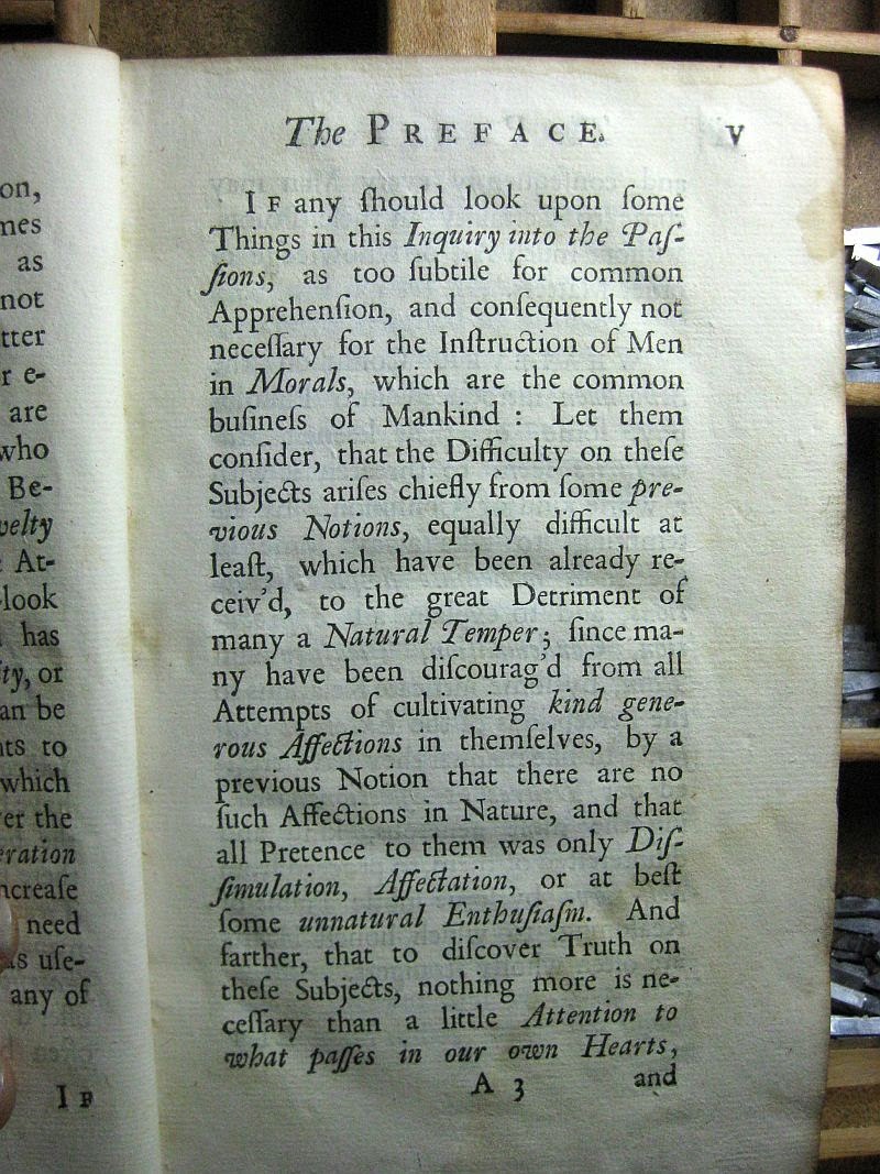
This is a 234 year old printed page. Ink is dense black, page is white, supple, very light foxing. It is anything but fragile. The original Gutenberg Bible is equally as amazingly preserved. These were well executed volumes.

This is my oldest paper bound book. It was printed in 1858. The pages probably do contain some wood product, but the pages are in good shape. This book saw a lot of use. You can see where the printed paper that was glued to the cover also covered a portion of the linen spine binding. Note the printed border. This border is hand-set from a border fount, or 'font'. Very often the binding print came from the same forme that printed the title page. This saved a whole lot of production time! One less forme to compose.

Naturally, the reverse cover of the book provided a handy opportunity to promote other products! In this case the most expensive book offered cost a buck twenty-five. Not cheap by 1858 standards, but not nearly as expensive as the calf-skin bound books!

In the 1810s and 1820s, the art of wood engraving, a white on black illustration technique that produced much finer lines, or "tints", make popular by Thomas Bewick. This little volume incorporates locally engraved (Philadelphia) illustrations, more than likely engraved upon end-grain boxwood.

Here is a close-up of the engraving showing the Queen of Sheba (or Ethiopia) visiting King Solomon. I think she is talking to him about the trip up from Opir. Rough cruise. Got any coffee, man? BTW, for you Bible Quizzers, this book is awesome. In fact, it's fearful how well eight and nine year old kids knew their Scripture, if they had to drill from out of this book! They not only learnt the scripture, they learnt how to handle it, and how it dealt in context with the chapter. It was a different America, friends.

This is the next book in chronology of the year of publication. This is a primary school Botany textbook by none other than Harvard Professor Asa Gray. This book was printed in 1867, and was aimed at twelve year old kids. My wife, who has her Masters of Christian Education from New Orleans Baptist Theological Seminary informs that the reading level presented by this book is at very least today's college level reading. The cover - if you can see it, it's pretty faded - is entirely printed from a single engraved block of Boxwood. Now, saying that, know that boxwood does not grow thicker than three to four inches in diameter. This wood was milled, glued with other cut pieces of end-grain boxwood, surfaced, polished, and made ready for the engraver. Often, pieces of wood were engraved first, each piece going to a separate engraver, then milled together to form one picture, or image. The resulting seams were "stitched" over by an engraver, which meant that he engraved connecting lines through the seams, which hid them. Often a multiline "tinter" would do the trick. This was how Harper's Weekly could get those huge engravings out at a very fast speed for the latest edition.


These are close-ups of the cover illustration. Absolutely beautiful. I can imagine this book new, with it's fresh printed baby-blue cover and dense black ink making the illustration literally "pop". Interestingly, when you think about it, just as much work went into engraving this piece as would have gone into several fine-bound volumes. Of course, several tens of thousands of prints resulted from that engraving!
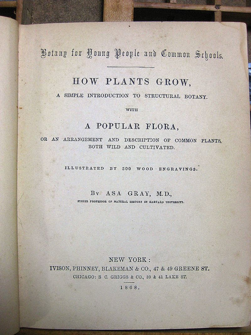
This is the title page, showing the printing date and location. The paper is in amazingly good shape. It is highly sized and polished, which renders an excellent letterpress impression.

The Introductory page. They sure don't teach science like they used to! But then "Origin of Species" was less than nine years old at the time, and was not empirical in nature. As a whole, in 1867, science was still true Science, and had not left it's empirical base as of yet. Hence, mention of a Creator God was not considered contradictory. Science was not yet an opposing religion.

Here is detail from the engraving which frames the text. This sort of printing was not common before the days of Thomas Bewick. Printing was starting to become an aesthetic art form, even in school books. Keep in mind, this is a "cheap" paper back.

Like the Child's Scripture Question Book, the reverse cover serves as an advertising venue. It's interesting to read the topics and prices listed. Note that Spencerian was already being taught by this time (1867)

This little paper back is my favourite of the bunch. It was printed for the German Communities from out of Reading, PA. The entire book is printed in Fraktur, and showcases German wood engraving, of which the Printers of Germany had always excelled, both in wood cutting and engraving. Some of the finest German Printing, oddly enough, comes from out of the Deleware Valley, SE Pennsylvania. The title, translated, reads "My Second Book" ( Sundayschool and Home, reading and study book for the mid - year class) The mid, or middle classes would be approximately third or fourth grade.


This is not a large book, it's actually quite small, as you might be able to ascertain from the top photo. These are photos of some of the many engravings in this volume. The art style reminds me of the German Illustrator - Jounalist who made Pro Southern propaganda wood engravings during the War Between the States: Adalbert Volk. Very few of these engravings have attribution.


Fast - forward to the later 1880s and early 1890s. The "Paper Back" has not changed from it's 1850s form, still retaining it's printed paper cover sheet glued over pulp board, and with the same linen re-enforced and covered spine. This is a Hymn & Tune book. It was either used in a very small church, or used during outside stump revivals. Many homes had the latest pump organs, and these would be the music books used. Of course, you have the advertisements on the back of the book to order more music.


This book combines Psalter with scored Hymns. The upper photos shows the more or less Psalter format which the congregation sang, the back part of the book is scored notation for the organist, pianist, or other performer.

Here is the newest in our Collection, dating to 1902. It is again, a childrens' school book. There are no advertisements on the reverse, This is rather late for this sort of binding. By now, chromozylograph printed linen book covers were becoming the norm. I believe the McGuffy Readers were also paper backed in this manner as well.
Well, that's it for the tour, starting in 1730, and winding up in 1902. I am doing this because Paper Wren plans on producing a line of private Journals, following the same protocol and binding technique. More to come, stay tuned!
G. Johanson, Printer
Paper Wren Press
Deltona / Orange City, Florida


