slideshow

Wednesday, May 28, 2014

What's New With the Paper Wren? Pocket Journals!


My last post, dated March 31, covered a little bit of what we at Paper Wren Press were just starting to investigate, namely the world of book making.  In that post, I wrote about the changes that had evolved the art and industry of book binding from the 18th century, into and through the19th century, focusing on the Paste Board bound, or should I call it the "Paper-Backed" book.

Writing that post peaqued my curiosity enough to perform a bit of forensics on my 1854 Child's Scripture Question and Answer Book.  The idea was to reverse engineer the construction of that book, to see if we could perhaps create something similar here at the Wren.

One thing led to another, and soon enough I found myself engaged with a lot of Google searching, talking with professional bookbinders that specialise in hard case-binding, and a whole lot of experimentation, running back and forth between here where my shop is, and downtown, sixty mile round trips..

After several stabs at several methods, keeping one eye on the 1850s era Paste-Board bound book that I was using as a model, I finally came upon a process that is authentic, yields authentic results, and is actually do-able from our studio, albeit on a limited scale.

This book (shown above, entitled "The Childs Scripture Question Book", American Sunday School Society, Philadelphia, 1854) served as the model for what has become our first blank Journal.  It has a linen spine covering, with lacquered or waxed paper covered boards.  The inside board covers use the same paper stock as the pages themeselves. The book is sewn through what appears to be four sawn openings at the ends of the signatures.The threading follows the typical in - and - out stitching, with what might be kettle stitched head and foot ends.  The boards themselves seem to be not unlike chip board.  It may be laminated paper boards.  The original 1850s "model" measures about 3-1/2 inches by 5 inches.

Here is how our version turned out.  These books are approximately the size of an iPhone-4, about 2.5 x 4 inches, nominally, thus considerably smaller than the 1854 model.  They contain about 90 pages, sewn in three-sheet signatures.  The backs are linen, the boards are medium mill chipboard, the paper used is Natural White Classic Laid.

I decided not to build a stitching frame, but rather, to entirely kettle, or "ketch" stitch the signatures together.  Smaller books of this size lend themselves to this sort of hand stitching because the stack of signatures, or "text block" can be easily held. Just make sure for clean hands!  In Kettle stitching, the signature above is sewn, or rather, crocheted to the signature beneath using a curved needle. The thread I use is a thinner upholstery thread which I immerse in melted beeswax, "shave" to remove the excess, and re-spool.  This prevents tangling and eases the friction of the threads passing through the punched holes of the signature sheets. Since the signatures are pre-punched with an awl and punching jig, the stitches form straight vertical lines.

This is a good view of the spine stitching. Something I do is "X" the stitch lines together.  I just like the way it looks, but it also provides a bit more "grab" for the mull when applied, and for the signature ends.  More than likely it's just something I think looks cool, and actually has zero effect on anything at all.  But I have a hunch it does add a modicum of support.  Perhaps some of you experienced binders might have a comment to make about this?  What you see above is the text block or "block" resting on it's half finished casing.  I use this photo again further down in this narration.  Notice the number '3' on the block, and the corresponding number on the case's boards?  Each board had to be cut and sized according to the dimensions of the text block that would be pasted into it, which even under the most controlled of conditions, can vary.

Here is the mull covered spine. This cloth, glued over the spine, is called "Mull", and is usually a type of cheese cloth, however I used open weave stiff Muslin.  I don't think it's any different than cheese cloth but it's available.  Lots of PVA glue used, literally painted on the muslin mull.  This will set for a couple hours while I take care of other business, such as finishing the cases. Ever try to find cheese cloth lately?

These are the cases.  Medium mill chipboard with black linen spine lining. I use this, rather than Davey Board, largely to hold down costs, and because I really don't think it's necessary for these types of books.  Time may prove me wrong, but so far on my field "beta" version that I have been carrying with me for a while now, the boards are doing just fine. Later in the process, a heavy paper will be glued over the boards, folded around the edges to the inside, the edges covered with end papers.

The interior of the spine cover is lined with heavy paper, which is glued into the casing, again using PVA glue.  This provides extra support for the spine and hinges.  The paper is rubbed down with a bone folder, then inserted into what is called a "nipping press" to dry. The pressure exerted by the press prevents warping and buckling while the glue is drying.

Here is the whole set-up.  The operation sets atop a very large stack of cheap padded paper.  It makes for a good disposable work surface.  When things get messy, tear off the top sheet!  Shown are the cases (boards), glue, scissors, roller, text block, and cover paper...ready to be pasted in.

Before the text block is glued in, the boards are covered.  This is where "Paste Board Binding" or "Paste Board Covers" get the name.  I use one of two types of paper to cover the boards, both of which are heavier then 25 lb text weight paper, but lighter than 65 lb cover.  One type that I use for cover is white with blue grey fibers woven through the stock, the other is a very nice faux parchment, which actually behaves like a very thin vellum. This "parchment" paper has been discontinued by the manufacture: I purchased it as a close out item years ago.

 
The cover paper is glued to the front of each board, and wrapped over the edges, folded and glued to the back, as shown above. Glue is then spread over the top sheet of the text block, and the board is folded over and closed on the block, the glue adhering the top page to the back of the board.  This becomes the covering for the inside of the board.  The same process repeats on the other side of the text block and corresponding cover.  The closed book is then placed in the nipping press under slight pressure to dry.  The end sheets on either side of the text block are not part of the sewn signatures.  They are glued into the text block specifically for the purpose of becoming the board covers.  This is why they are called "end sheets".

After drying, the book is examined.  Care must be exercised when closing the boards over the glued end papers, to make sure that the text block is square withing the binding and evenly covers the interior of each board.  The hinge of the book is formed by the space between the spine and the board, a gap usually between 1/8" to 3/16" for this size book.  This book, remember, is only the size of an  iPhone.

I also check the spine.  Since these books do not have headbands (they really don't need headbanding at this size, although a headband can cover a multiple of ills!) I need to ensure the signatures are laying evenly, and the spine is straight, not angled. I do this both before and after the books are placed in the press to dry. First, to make sure they are straight, and afterward to make sure I made sure they are straight. The front pasted paper cover covers the linen spine cover by about 1/4th of an inch, and there is a fair degree of even-ness between the front and back.  Remember, a lot of this is done by eye.  This journal came out very nice!  

One of the things I have been doing is "field testing" these journals for durability.  This is my own personal journal.  I carry it with me, and have been writing in it every day since March.  The idea is to identify any problems that may happen in time, with opening, closing, rugged use, bending the spine, carrying the book in my pocket with car keys and Lord knows what, carrying my book in a back pack or carry pack.  I have a pencil rubber banded to the book.    This particular version has three stitches holding each signature, I have since increased that number to five.  Just be sure that there are no prolapsing of the pages. Prolapsing is when a sheet that composes a signature bulges, or pops away from it's place in the fold because nothing is there to hold it in place.  Stitches set to wide apart can cause this.  This is why I added stitch rows, increasing from three rows to five rows.

It takes typically a two days to make four or five books.  They are time consuming and labour intensive.  But they are nice, especially if what is wanted is something a bit more durable than a Moleskin or Field Notes book, with more pages and a lot more permanency.  These books are also, in my opinion, a bit more convenient for modern pockets, which is why I opted for the "Cell Phone" size, specifically: the iPhone.  In fact, they fit nicely into iPhone cases!  Hmm.....maybe I can interest Apple.....

These books are products of the mid 19th century, and literally thousands of these original books are still with us today.  That tells me something about the durability of this method of casing a book.  The diminutive size is also not novel: miniature books and journals have been popular since the 16th century.  In later years they became known as "Vest Pocket" size books, or Waistcoat size books, fitting in the tail pockets of a waistcoat (pronounced "westcut".  Really.  Ask Jude Law.)

As an aside, just what is a Nipping Press?

Here she is, in all her glory.  This particular press is unique, in that it has multiple pressing layers, two are shown, and locking ratched sliding rails.  The whole press is iron and phenol, which looks like wood, but is actually a woven fabic resin developed during WW2 for indestructible moulded casings.  This press was made around 1945.

These books will be made available on our Etsy Shop soon.  More entries concerning these books, particularly the sewing of the text blocks, will be upcoming.  We also have more card designs to show, and some nice shots from our latest show at the DeLand Indie Market.

Stay tuned!

G. Johanson, Printer.


Monday, March 31, 2014

Book Binding, the Print Shop, and the Industrial Revolution.

Bookbinding is an amazing art, the art of keeping a culture protected.  Some would say that book binding is the art of protecting civilization.  The bound book has taken many forms depending upon era and region.  In the West, the bound codex consisted mainly of pages sewn together, attached at  a spine of sorts, incorporating hinged wooden or leather covers to protect the contents.  Over the years, procedures and processes became codified into  patterns that have been followed, in the main, throughout most of the Western World.  By the time of Gutenberg, wooden boards were replaced by leather, which was scraped and glued over either thin wood or later, compressed paper board, resembling chip board.  The leather board and spine covers were worked, and tooled by master craftsmen, the work of which remain unrivaled for their beauty to this day.  

Books from the 1600s and 1700s vary little in respect to binding convention (which means, there may have been all sorts of types, sizes, folds, but in general, apart from those exceptions which always raise their hands in protest whenever a generality is expressed....most of these variations shared basic features and processes.)  The printing convention may have undergone changes and development, but a book bound in 1690 looked pretty much like a similar book bound in 1810, apart from style points.

Sidebar note:  I invite correction on any point I make.  I am a printer, not a book binder, but I have collected and observed up close - and from the "inside" -  these features which I describe from my own book collection, which spans over 280 years. I am not and expert, at book binding.  Only an admiring printer that dabbles. For expert advice and example, check out James Moore's 18th Century Bibles site.

Binding was never cheap.  It was costly.  In a day when skilled professionals could expect to earn an equivalent dollar a day,  whereas earning ten dollars weekly was a considerable sum, nigh unto impossible, a well bound book could cost nearly an entire week's salary.  A twenty five dollar legal textbook in a Lawyer's office might have cost a few month's pay for the local yeoman, the smith or cooper....or printer. (more than likely, bartering was done here in the Colonies.)

By the 1820s, changes were starting to take place in the paper, binding and printing industries as mechanization began it's inexorable march.  Presses became more efficient, requiring less man power with greater focus on, and production of,  "job" printing.  Paper prices came down owing to technological advances and mechanization, and the introduction of wood pulp.  As a result, the cost of books began to fall fairly dramatically by 1840.  And here is where we begin our little tour. 

In this entry we will be examining but one example of the changes wrought by the "Industrial Revolution", which brought about the first true "Paper Back" publications.  By Paper-Back, I mean hard bound books that use no leather or cloth on their covers save perhaps for covering the spine, such as linen tape. 
Books need Titles, and traditionally titles were worked into the leather spine covers, more often than not leafed with gold.  I have seen no case where the title of a book in the pre-19th century era has it's title on the front board.  Universally, the name of the book was tooled into the spine cover.

In time, with the introduction of cheap pulp cardboard, leather began to be replaced by paper.  Paper  covered cardboard boards were attached to the spine of the book by way of a glued linen or sized cotton strip which was, in turn, glued to either the spine board covering or the spine cloth. By the 1870s, metal staples began to be used.

This was quite a boon to the printer.  Think about it: do you really need a finely tooled leather daily ledger for your small business?  Does your ten year old kid....scribbling all over his Cyphering book.....really need a costly leather bound volume that he will outgrow next year, if that book even survives this year?  These paper-bound books were far cheaper, which meant greater access to book by folks of lesser means.

Printers naturally discovered that they could simply print the titles of these books on paper, and glue the paper to the covers.  They also discovered they could advertise other of their productions on the paper backs of these books.  Of course, this further dropped the price of books.  Often, both printing and binding of these types of books took place entirely in the printing office, instead of a separate book binders shop.  Since leather work was very nearly out of the paper binding process,  many printers took up the job of sewing and casing, later - wire stitching, in short, assembling the pages and applying the covers.  Over time, machines began to replace the hands that performed even these tasks.

The increase production of the cheaper paper bound, paper covered books did not mean that fine book printing ceased.  Those volumes intended to be a permanent part of the family library, handed down generation to generation, continued to be finely bound, artfully appointed, and well made. And, such books continued to be expensive.  Such began to be referred to as "find bookbinding".

Regarding traditional leather, the technology to produce cheaper leather forms did become available, leather veneers, Moroccan leather, the ability to hot stamp gold foil, moulding, batik, mass produced sized cotton and linen book cloth, all these combined to make what was once a very expensive hand craft a much less expensive mass produced product.  In my opinion, it were these first "Paper" bound books with printed and glued paper covers using pulpwood boards, books that were not meant to last a life time, which filled that information or entertainment void between Almanac, Journal, Ledger, Periodical and Children's School book - and the Fine Bound, quality made book. By 1850, a preponderance of School books, informational books, some types of Church music and hymnals, Sunday School books, inexpensive novels or children's books, books not necessarily meant to last a lifetime or beyond, were almost universally printed and bound in this inexpensive manner.

As to longevity of these "cheap books": it turns out, many of them DID last well beyond their expected lifespans, surviving the Civil War, and several generations thereafter. Many of these books were stored in places where they were forgotten, or lovingly tucked away as mementos.  Some were just plain well cared for!

Here are some of these books from out of my own collection.

We'll begin with the common book as we knew it in the Americas all through the 18th century, and into the dawning decades of the 19th century. While I have seen printed cover paper bound books as early as 1840, my own collection begins in 1858.

This is a typical calf skin vellum binding, circa 1730.  It is what I would call a "fine" bound book.   It features tooled front and back covers, a tooled spine cover, and is also stained in concentric rectangles. A lot of work went into this book: it was costly to make, and very expensive to purchase.  I purchased this book for a considerable sum myself, but that sum, compared to it's original purchase price, was fractional.  It did not cost me a week's salary!!  This book has not been restored, it is fully original, and threatens to outlive me before it ever needs restoration work!!  Colour me intimidated.

The leather is worked into the spine of the pages, or "text block" itself.  Usually a few strips of paper or linen were glued between the paper "signature" folds and the leather itself.  Sometimes, especially in the 1400s and 1500s, ancient vellum manuscripts were cut up and used.  Modern restorers of such books have discovered hitherto unknown manuscripts from recovering these vellum spine strips, dating to the twelfth and thirteenth centuries!  Of course, in 1490, these hand written vellum manuscripts (MSS) were not seen the way we see them now.  Far from priceless, many fell prey to the local book binder.  In the spine cover of this book, the page cord around which the signature thread is woven, is clearly seen , a total of five, the leather working around them.

A close-up of some of the tooling and leather dying.  There are three colours on this book's covers, front and back.  For being 280 years old, this book is in amazingly good shape. Normally, since papers before the 19th century were made from 100% linen rag, with no lignin or tannin to stain the sheets or cause it to become brittle, the papers normally outlived the leather binding itself.  It was not uncommon to rebind a book every century or so.  Let this be a tip (remind me to tell you how we got that term "tip") to you novice collectors: you cannot judge a book entirely by it's cover.  I found a complete set of DeFoe editions from 1750, rebound beautifully in 1900.  They were still quite desirable for any collection regardless of the newer binding.  Good binding is good binding, and as it was, I was outbid by another collector.  But I almost missed this set entirely from external appearances!

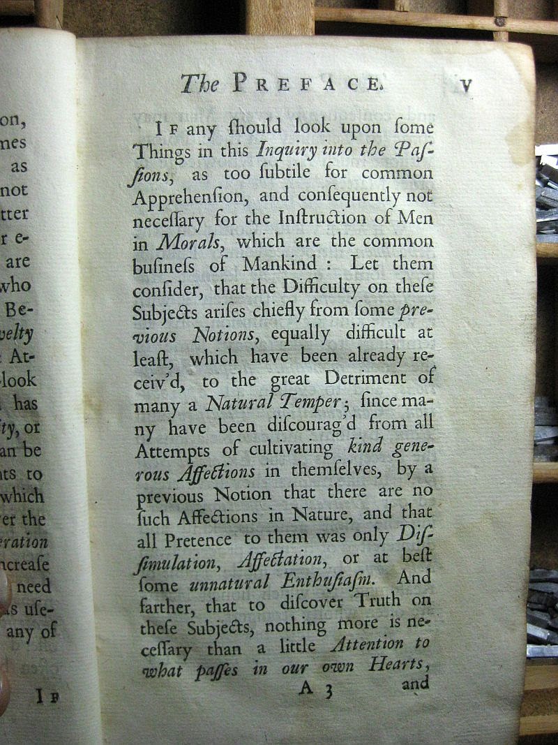
It took normally anywhere from a year to several years to complete a book in the 15th - 18th centuries. The ink is boiled flax seed oil, coloured with lamp black (carbon), printed on what I consider very good papers. The actual precision and skill of the execution of the print varied from press to press, and printer to printer.  The presses of the period, "Common Presses" were difficult to apply consistency.  Each impression was individually inked with varying charges of ink, the pressure applied to make the impression sometimes varied in pressure from print to print, even as the paper itself varied in thickness from print to print, although not so much as to notice by handling.  Even as consistency may have been difficult to apply in exactitude,  the books printed were amazingly uniform for what they were able to execute.

"Punch Through" was not uncommon. Especially with impressions containing large letters requiring large areas of solid ink coverage.  The more the print area size, the harder the impression.  The harder the impression, the higher chance of some portions of the impression to penetrate into the reverse side of the page.  This is the reverse of the title page, which was a very heavy strike.

Even on the text pages, a little of the ink could emboss the opposite side of the page.  Here, we can see a little embossing.  Not horrible, actually it's pretty good.  Notice how white the page is!  Also, the pages are as supple as they were new.

This is a 234 year old printed page.  Ink is dense black, page is white, supple, very light foxing.  It is anything but fragile.  The original Gutenberg Bible is equally as amazingly preserved.  These were well executed volumes.

This is my oldest paper bound book.  It was printed in 1858.  The pages probably do contain some wood product, but the pages are in good shape.  This book saw a lot of use.  You can see where the printed paper that was glued to the cover also covered a portion of the linen spine binding.  Note the printed border.  This border is hand-set from a border fount, or 'font'.   Very often the binding print came from the same forme that printed the title page.  This saved a whole lot of production time!  One less forme to compose.

Naturally, the reverse cover of the book provided a handy opportunity to promote other products!   In this case the most expensive book offered cost a buck twenty-five.  Not cheap by 1858 standards, but not nearly as expensive as the calf-skin bound books!

In the 1810s and 1820s, the art of wood engraving, a white on black illustration technique that produced much finer lines, or "tints", make popular by Thomas Bewick.  This little volume incorporates locally engraved (Philadelphia) illustrations, more than likely engraved upon end-grain boxwood.

Here is a close-up of the engraving showing the Queen of Sheba (or Ethiopia) visiting King Solomon.  I think she is talking to him about the trip up from Opir. Rough cruise.  Got any coffee, man?  BTW, for you Bible Quizzers, this book is awesome.  In fact, it's fearful how well eight and nine year old kids knew their Scripture, if they had to drill from out of this book!  They not only learnt the scripture, they learnt how to handle it, and how it dealt in context with the chapter.  It was a different America, friends.

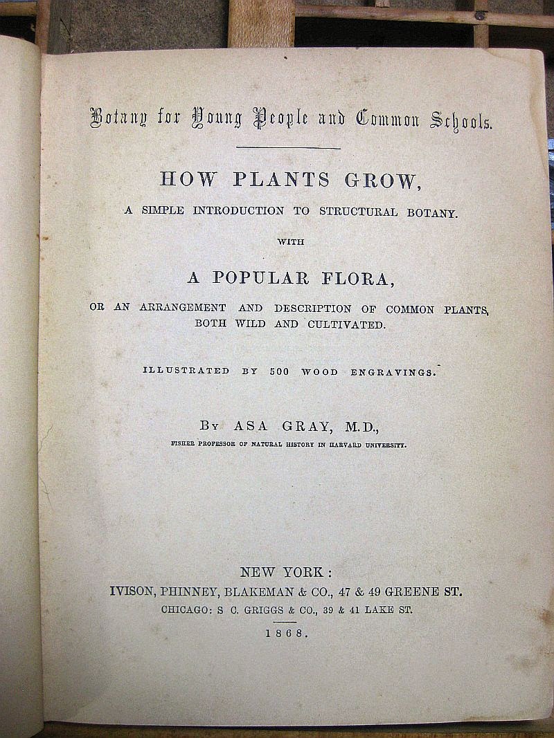
This is the next book in chronology of the year of publication.  This is a primary school Botany textbook by none other than Harvard Professor Asa Gray.  This book was printed in 1867, and was aimed at twelve year old kids.  My wife, who has her Masters of Christian Education from New Orleans Baptist Theological Seminary informs that the reading level presented by this book is at very least today's college level reading.  The cover - if you can see it, it's pretty faded - is entirely printed from a single engraved block of Boxwood.  Now, saying that, know that boxwood does not grow thicker than three to four inches in diameter.  This wood was milled, glued with other cut pieces of end-grain boxwood, surfaced, polished, and made ready for the engraver.  Often, pieces of wood were engraved first, each piece going to a separate engraver, then milled together to form one picture, or image.  The resulting seams were "stitched" over by an engraver, which meant that he engraved connecting lines through the seams, which hid them.  Often a multiline "tinter" would do the trick.  This was how Harper's Weekly could get those huge engravings out at a very fast speed for the latest edition.


These are close-ups of the cover illustration.  Absolutely beautiful.  I can imagine this book new, with it's fresh printed baby-blue cover and dense black ink making the illustration literally "pop".  Interestingly, when you think about it, just as much work went into engraving this piece as would have gone into several fine-bound volumes. Of course, several tens of thousands of prints resulted from that engraving!

This is the title page, showing the printing date and location.  The paper is in amazingly good shape.  It is highly sized and polished, which renders an excellent letterpress impression.

The Introductory page.  They sure don't teach science like they used to!  But then "Origin of Species" was less than nine years old at the time, and was not empirical in nature.  As a whole, in 1867, science was still true Science, and had not left it's empirical base as of yet.  Hence, mention of a Creator God was not considered contradictory.  Science was not yet an opposing religion.

Here is detail from the engraving which frames the text.  This sort of printing was not common before the days of  Thomas Bewick.  Printing was starting to become an aesthetic art form, even in school books.  Keep in mind, this is a "cheap" paper back.

Like the Child's Scripture Question Book, the reverse cover serves as an advertising venue.  It's interesting to read the topics and prices listed.  Note that Spencerian was already being taught by this time (1867)

This little paper back is my favourite of the bunch.  It was printed for the German Communities from out of Reading, PA.  The entire book is printed in Fraktur, and showcases German wood engraving, of which the Printers of Germany had always excelled, both in wood cutting and engraving.  Some of the finest German Printing, oddly enough, comes from out of the Deleware Valley, SE Pennsylvania.  The title, translated, reads "My Second Book" ( Sundayschool and Home, reading and study book for the mid - year class)  The mid, or middle classes would be approximately third or fourth grade. 

The title page is, essentially, the cover printing minus the border.  There is no date in this book, but judging from binding, paper, printing, and a bit of handwriting found in this book, I approximate it to 1870 - 75.  One reason I park these dates is because one of the History stories in this book mentions an incident among the Delaware Indians happening in 1745, "one hundred thirty years ago".


This is not a large book, it's actually quite small, as you might be able to ascertain from the top photo.  These are photos of some of the many engravings in this volume.  The art style reminds me of the German Illustrator - Jounalist who made Pro Southern propaganda wood engravings during the War Between the States: Adalbert Volk.  Very few of these engravings have attribution.


Fast - forward to the later 1880s and early 1890s.  The "Paper Back" has not changed from it's 1850s form, still retaining it's printed paper cover sheet glued over pulp board, and with the same linen re-enforced and covered spine.  This is a Hymn & Tune book.  It was either used in a very small church, or used during outside stump revivals.  Many homes had the latest pump organs, and these would be the music books used.  Of course, you have the advertisements on the back of the book to order more music.


This book combines Psalter with scored Hymns.  The upper photos shows the more or less Psalter format which the congregation sang, the back part of the book is scored notation for the organist, pianist, or other performer.

Here is the newest in our Collection, dating to 1902.  It is again, a childrens' school book.  There are no advertisements on the reverse,  This is rather late for this sort of binding.  By now, chromozylograph printed linen book covers were becoming the norm.  I believe the McGuffy Readers were also paper backed in this manner as well.

Well, that's it for the tour, starting in 1730, and winding up in 1902.  I am doing this because Paper Wren plans on producing a line of private Journals, following the same protocol and binding technique.  More to come, stay tuned!

G. Johanson, Printer
Paper Wren Press
Deltona / Orange City, Florida


Monday, March 17, 2014

"Faith of our Fathers" Colonial-style Notepads!


It began as a Fund Raising Idea.

As the creative juices began to flow,  the idea of something every-day-practical began to form.  I don't know about you, dear reader, but I am one who requires paper notes.  Note pads are the mainstay ingredient of both my Optical Clinic where I practice as a Licensed Optician, and also in my music as a performing guitarist / song writer, and also my Amateur Radio activities at A.R.S. WD4NKA. Not to mention Paper Wren Press! Indeed, I live and breathe paper : a pen and paper will carry me much more efficiently than the time it takes to type things into my iPhone, Kindle Fire, or any i-Pad that I've had party to, nice as they are.  

Another dynamic began to emerge.  Our church's summer missions projects, one to Haiti, another to Belgium to help serve at the Ghent Music Fest. These good folks have to raise their own money.  Why not help them out?  

Still another dynamic that came into play was the historic and traditional nature and legacy of the Letterpress Process.  Not to mention the fact that Paper Wren's "house fount" is the Old Style No. 337 Caslon, a very good representation of the Caslon that was clearly the most commonly used font in the American Colonies of the 18th Century.  

The idea came to me to create something that would both display Letterpress in it's element ( letters....hello?), and something that would harken back to the heyday of the font I planned to use.  Having a fair background with 18th century publications, and possessing several specimens of these publications, I thought it might be a bit different to print scripture based notepads conveying not only a Bible verse, but doing so in a way that would have been readily recognised to the American or English 18th century reader.  This would include the often confusing (to the modern eye) "tall S", that 's' that looks like an 'f '.  The figures are a bit different, too, with descenders.  Also included in these old fonts are what are called "quaints", which not only the tall 's', but archaic ligatures, where two letters are joined together on one piece of type.  Most notable from this era would be the "st" and "ct" ligatures.

We also chose a foundry border consisting of a Maltese Cross spaced by a horizontal 'lozenge'.  Both of these pieces harken to the 18th century.  The border has to be 'built up' as the text, or body type, is being set.  This can resemble building a puzzle, choosing the different quads and spaces to support both the type and carry the borders evenly, and in a way that the pieces-count works out.  

The results are shown in the following photos:
 
This is the assembled type with border, locked together in the chase that will hold it in place on the press. These small lock-ups are no easy deal: it's easy to apply too much pressure when tightening.  The idea is to hold the type and all associated pieces firmly and solidly without so much pressure that the chase iron begins to torque, or the "forme" begins to buckle.  It must lie perfectly flat, which is why the imposing table upon which this lock-up is created is graded and polished granite.


Once the press is inked, makeready is complete, and initial centering adjustments are made, a proof is pulled to gauge the depth of impression, level of ink on the forme, and leveling / centering geometrics.


This particular verse is Galatians 2:20.  Notice the Maltese Cross / Lozenge border.  The text needs to center within this border as centered as possible.  The Capital is inset, which presents a whole other set of challenges.  On this particular verse, the capital has no adjoining letters to form a word: it stands alone, so I spaced the other letters away from it.


This verse is John 3:16, where the inset capital is part of a multi-letter word.  Thus, I did not space the "O" from the capital "F".  But the line below is spaced by a 5/em space.  These verses are left justified.  The Bibles of the period exhibit both full justification (both sides of the column) or left only justification.  Because of the balancing act of setting type simultaneous to an assembled border, I chose the latter form of justification.  Choose your battles.


I have always liked the strength and finished look of an end binding on both Notebooks and Notepads.  In our case we chose to use a linen fabric tape binding.  This is the same as used for Composition Books.  The front and back covers are recycled chip board.


. . . and here they are!  Each pad contains one verse, a total of four verses are printed.  Pads measure approximately 4.25" by 5.5", perfect to slip into an A-2 sized greeting card (which is the size greeting cards we tend to print at the Paper Wren.) 


Each pad contains fifty sheets of text weight Natural White Classic Laid, closely resembling the paper types used in the 18th century.  These sheets are both pen and pencil friendly, have a low acid content, and have a very slight texture. The inks used are Linseed Oil based, carbon black and red.  The border is hand designed, printed using a copper die produced by Owosso Graphics.  I drew the original design after an actual tatted lace piece.  And, of course, tatting was huge in the Colonies of the middle eighteenth century.


We conscripted our type-metal "Doughboy" mascot to help hold the pads while we did the photo-shoot.  This is the completed "John 3:16" pad.


Here is a close-up of the Psalm 118:24 card.  Here, we balanced the capital "T" between the two lines of verse.  The way the verse address is spelt is also authentic to the time.  I have seen the italics juxtaposed between chapter and verse, and sometimes the roman numerals are in small-caps, but I thought the italic might provide an interesting break.


This is a close-up of John 3:16.  I might mention that the version of the Authorised KJV used in these cards are the 1768 Oxford text revision.  The King James version had experienced three major revisions prior to the Oxford Revise, or the "Blayney Edition", which followed Cambridges earlier "Parris Edition".  I must hasten to say that these revisions had nothing to do with the content of the text, but rather reflected the changes wrought in the English Language between 1611 and 1750.  Also, the Oxford edition made use of the Italicised letters to denote words added by translators to make the Koine Greek or Hebrew understandable in English.  Another revision was produced still later, with further updated spellings.  The Bibles most known in the Colonies of 1769 would have been either the Cambridge Parris text or the Oxford Blayney, there are only minor variant differences in spelling and use of margin notes.  Also, later versions of the simpler, locally printed Bibles omit all notes and Apocrypha, such as the Bible produced by W. Young, Bookseller and Printer, 1783.  It should be recognized that actual printing protocol in minor technical details vary from printer to printer.  These are called Printer's Vagueries.


A close-up of Galatians 2:20.


. . . and Philippians 4:6.


The "Black Letter" font used might be about one hundred years old.  It was labelled in the tray as "Lombardic", but I have to research that.  Such as it is, it does match 18th century titling specimens, and is authentic to the era.    The use of the word "Ye" might be noted as well.  In the early days, when Saxon characters still mixed with roman characters, it was not unusual to find Celtic letterforms in use.  Baileys Dictionary of 1732 describes the English "th" consonant sound as being represented in the old Welch and Saxon as a character that resembled a capital "U" with a right-side descender.  This made it look a little like a "y" to the more modern, 15th and 16th century eye.  Thus, printers began the convention of using the "y" character as representative for "th".  Thus, the line reads "the good Printers of the American Colonies"


When we did the photo takes for the Etsy Shop and this blog, I couldn't resist bringing out my quill pens.  Yes, I'm one of those crazies who cut and scutch their own pens.  This particular pen has a late 19th century modification promoted by none other than Edward Johnston, who consulted with Gill in the designs for Kelmscott Press fonts under the watchful eye of William Morris.  Johnston advised the use of an added ink reservoir cut from the spring of an alarm clock!   That's what I did.  His was an internal 's' shaped piece of spring metal inserted into the shaft, mine is more like Mitchell's reservoirs, external, and cliped over the nib split.  Either way, I owe the whole idea to Mr. Johnston, late of Kelmscott Press.


I had to include this.  I get a lot of the "what the heck is that 'f ' doing in there??"  When I explain it's common use, I usually get the incredulous stare.  SOOooooo......if you also have that indcredulous stare, here is a page from J. J. Rousseau's "Eloisa", printed postumously, in English.  The actual printing was done in Dublin, 1795.  The tall 's' appears at the beginning and in the middle of any word.  The small 's' occurs only at the end.  Not unlike Greek, really, which also employs the use of two 'sigmas', and used in the exact same manner.

These pads are now available on our Etsy Shop. Stop by and visit!  Also, note that we can also do other verses or perhaps that favourite line from Jane Austin's "Pride & Prejudice".  The terms for custom orders are explained on Etsy.

That's it for now.  Stay tuned!

You Humble Servant,

G. Johanson, Printer.