slideshow

Monday, October 28, 2013

A Wedding Suite for Sarah: "Paper Moon"

Sarah contacted Anna Coleman to design her wedding stationary.  The result was this extremely appealing suite we couldn't resist but name "Paper Moon".  It has that the feel of those lyrics:

Well, it's only a Paper Moon,
Sailing over a Canvas Sea,
But it wouldn't be make-believe
. . . if you believe in me.

It's a sweet song from my childhood, and the tune came to mind the instant I saw Anna's thumbnail sketches and final inked art.  Anna did her final rendering in ink-on-vellum. (sigh), such a traditionalist.  She should only be a letterpress printer!


As with almost all our custom printing, the stock used was Crane's Lettra, 100% cotton rag content, which features an extruded, luxuriant tactile feel to the touch, and which receives the inked impression with just the right amount of deboss to render a spellbinding three-dimensional effect. In the following photos, I had to angle the light in different positions to best pick up this deboss effect, which is why some image come out bluer than others.  I am not using a professional camera: it's a Canon Powershot.  One day I'll splurge for that $1200.00 Nikon, but till then, these images will be produced by the good ol' point-and-shoot.


Coming in a little closer, you can see the titling font that I used: Caslon Open, 18 pt.  Script is Bickham.  The ornaments which were designed by Anna consist of a crescent moon, rose and petals, and two little Love Birds nuzzling on the lower crescent of the moon.


Aww. . . . is that cute or what?  Anna specializes in what she has come to all Animorphism, which is, rendering animals in their lifelike character and nature, yet matching that nature to human characteristics.  It was a concept she honed during her years at Flagler College, where she earned her BFA.  Pen and ink is her medium of choice, which works perfect for Letterpress. 


Another close-up of the Rose and Petal motif.


We call these corner designs "spandrels", the same term used for corner ornaments on Clock faces.


Caslon Open has become our favourite titling font.  I have this font both in digital format on the design computer, and also in foundry metal format, in 18 point font size.  This is a hard font to come by in the form of metal.  My particular "hot metal" font dates to around 1910.  In Sarah's case, we needed to size down her text to fit the ornament design proportionately, so we went the digital format font.


As you can see, we carried the Paper Moon ornament over to the RSVP, in reduced form.  The detail came out like an engraving!


Here is a shot of the card itself, to give an idea of the general lay-out and proportion.  This is a 4-bar format card which comes with a matching, addressed envelope.


A close-up of the RSVP


Another close-up, showing the text.


This is the matching Reception Card.  We carried the Rose and Petal Spandrels over, in reduced form, onto this card as well, with the same engraving-like result. 


A close-up of on of the Spandrels . . .


. . . and the text.


Here is the Suit all together, with addressed matching envelopes.  I might add that the envelopes are text weight, semi-sized, and are calligraphy-pen friendly.  Shown here are: Reception Card, A7 announcement, and RSVP.  Envelopes are addressed.

This suite is available for customizing. If you are interested in using "Paper Moon" for your own wedding stationery, contact us through our site, or email us directly!

That's it for now.  Stay tuned for our next installment!


Our 2013 Christmas Card, Now Available on Etsy!

It's that time of year again!  It's been an eventful year for us: in March, G. Johanson, Printer officially became "Paper Wren Press", and almost immediately thereafter I found myself in the hospital coming within an inch of my life and eternity.  After several months of recuperation,  we found ourselves creating  multiple suites of Custom Wedding Stationery, signing a contract with Affluent Bride, producing a series of greeting cards with designer Anna Coleman, attending two Indie Market shows, and now, it's Christmas.  So what are we doing for our card design this year?  Well . . . . 

Since time is of the essence, we decided to reach into the past and reprise our card from last year, only with some slight changes.  The first change is the "Christmastide 2012" legend, which we changed to "Merry Christmas".  It is still printed in oil based gold florentine, which I like a lot better than gold foil.  Another change is the reverse, which sports our new logo!  These cards are currently for sale on our Etsy Shop outlet. Another change is that this year we are offering a customization of this card: since the legend is typeset with 18th century Fleuron brackets, we are offering custom text, in which "Merry Christmas" can be substituted with another line or multiple lines.  For details, contact us either through our site at www.paperwrenpress.com, or directly via email at gary@paperwrenpress.com.

And now, some photos we took during the process of creating these unique custom limited edition Christmas greeting cards:


The black run on these cards were printed in folio, both sides at one shot.  This year, we included our logo, which is a mag cut.  We 'quadded' it out to accommodate text which is typeset beneath.  In essence, this card is "laid up", or locked up in the same manner the printers would have used back when the featured woodcut illustration was new : 1490!  Two years before Columbus' maiden voyage!  In fact, this cut comes from that part of Italy where Columbus hailed from at the same time in which he lived there!


Here's the first pull from the folio impression.


I flipped the camera around for a closer look, right side up.


Just in case Latin escapes you, this print in it's original 1490 publication was part of a larger volume entitled Legenda Sanctorum Trium Regum, which means "Legend of the Holy Three Kings", Modena Italia, 1490.  You Latin scholars check me out on this, ok?  Hey, how do you like our new Logo?


The completed card after the red and gold impression runs.  This card reminds me so much of the cards we would send when I lived in Munich, Germany as a kid in primary, or Elementary School.  That German cultural streak has been something I've carried with me my whole life long, and has influenced my design tastes almost to the point where sometimes I wonder if I shouldn't market my stuff in Europe!  As a Letterpress Shop in an era of Hipster "whimsical" design approach, we tend to be hopelessly Carolingian in our tastes.  That is, except for the designs we carry by Anna Coleman.


Here is the card after the printing process, where each card is scored and hand folded with a bone folder.  This card saw a run of 200 in this series, which means over 200 impressions through the press for the black, the red, the gold, the scoring of the fold line with a brass rule, then each card is hand folded to ensure a perfect and level fold.  A lot of hours . . . and a lot of Coffee!!


Another shot of the back side.  The card stock chosen is Crane's Lettra, 320 gsm extruded Pearl White 100% cotton, which comes with a matching envelope.


So, there it is.  Our 2013 Christmas Greeting Card.  It is an "A2" sized card, which means it measures 4.5 x 5.5 inches, bifold.  The interior is, as usual, left blank, ready for your own creativity!  Custom return addressing is available upon request, please contact us for details.  I might add that bulk ordering of this card at a reduced price is something that can be considered, but remember these are limited run cards, unique, one of a kind.  Thus, a bulk order would be considered another limited edition run. 

Thanks for joining us in our guided tour of this year's Christmas Card offering.  We have yet another design which might . . . might be able to be slipped in before December.  It is based upon the 1933 U.S. Christmas Seal.  More on that, later.

I remain Your Humble Servant,
G. Johanson, Printer.
Paper Wren Press.


Sunday, September 1, 2013

Hannah & Colin's Announcement, Part 3


So, here we are, day three.  Day one was design time and meeting with the Client, in this case Hannah and Colin, and getting the type-setting started.  Day two was when the materials arrived after about a week, and we started cutting up the parent sheet stock, and getting the first colour off and running.  Day three, colour mixing the Olive Green, positioning the die, make-ready, and touching base with Hannah, who decided not to print anything on the reverse of the RSVP, but rather, use that blank side for a reception activity.  Thus, we are done.

Here are some photographs of the final project.  I usually run several extras which I save for samples for future clients, so I ran over the needed 120 pieces.


Hannah wanted an Olive Green for the fern, which required a little custom mixing.  Now, very few of us Artisan types have a true scale for Pantone colour mixing, but we do have swatches which give us a pretty good idea what colours in what percentage offers up what colour, so with a little mixing with the ink knife on the ink disk of the press, we managed to balance out a great fern colour!  

Truth be told, uh . . . . Cindy actually did the eyeball work.


Nailed it!  What made it a bit complicated was the Ecru colour of the stock, but we did get a good colour match.  Thanks, Cindy!!


And here it is.  The fern snugged right in there with the type.  I cheated a little, really, when I set the type: I made a computer model using 18 pt. Caslon Open, which I have on my computer, and used 12 pt. Times Roman to give me a general computer rendition of the spacing, leading, and drift justification to accommodate the curve of the fern.  It actually worked out very nicely! 

So, this was it.  Job done, and tomorrow, Labor Day, the staff at Paper Wren will be invading St. Augustine for a hearty Last Hurrah for the Summer.  Time to break into the Winter Wedding Season with a job on the November Horizon involving an original design by Anna Coleman.

Stay tuned!

Hannah & Colin's Announcement, Part 2

Well, the paper arrived a couple days ago.  Hannah picked up the two boxes of matching envelopes for her Addressing Party.  The parent sheets arrived the next day.  So I spent all day yesterday in the Shop, cutting and trimming the stock, proofing the text, re-leading the lines (creating more space between each line to lengthen the forme) and finally, setting up the make-ready on the press and running the brown for each item of stationery, both the RSVP Post Card and the typeset text of the announcement.


For the RSVP, we chose to borrow from the hand drawn fern motif, which were adapted to form corners with "arabesques",  or 'curly-ques' in a more modern vernacular.  Just a bit of useless trivia: these little 'curly cues' were in turn, adapted from the filigree work executed by the London Scribe Clark, from a copper plate print sampling of his letter-forms which were printed in 1704!  There is a right way and a wrong way to execute flourishes with a pen.  If you want to contact a real expert, may I submit Angela Welch, for whom I do the printing of her amazing calligraphy.  Angela is also a designer for Crane Stationery, and owner of "Pen & Pauper".  


The size of these post card RSVPs is 3.5 x 5.5 inches, and can be printed front and back.  Post Card RSVPs have become a popular choice for brides & grooms to be for on reason: they cost less to handle, and somewhat less to have printed.  Post card postage is cheaper than a card in an envelope, and naturally an envelope is not needed. I'm all about saving my clients money if it can at all be done! 


A close-up of the fern motif corners.  Owosso Graphics created this metal die for me, and was able to hold the very, very delicate ridges, or rather, "ruffles" in each leaf of the fern itself.  Consider that each corner is about the size of a smallish postage stamp.  Hats off to the gang at Owosso.


Here is the announcement.  It turned out that while the curve of the original type setting was spot on, the lines needed to be leaded out, about one point per line to spread out the text. The above photo shows the black proof of the fern (an original pen and ink rendering, also made into a metal die by Owosso Graphics), trimmed close and adhered to the card to show the relative position of the fern in relation to the text.  The fern itself will be printed in green today.  I like the little fleuron touches at the bottom, it actually lent quite well to the fern motif.
 

Here is a close-up of the announcement inpression.  The ink used is boiled flax-seed based....Linseed, in other words.  This is a formula that is over three hundred or more years old.  The "Open Face" Caslon Titling font came out crystal clear, with an understated deboss that does not punch through the card, yet leaves a pleasing tactile sensation when handled.  But then, that's what Letterpress is all about!

Stay tuned for the next installment in our Adventures in Letterpress.


Tuesday, August 20, 2013

Hannah & Colin's Announcement


This order will be a bit different, which is why I am featuring it here.  How does an idea get from the drawing board to the Letterpress, to the Client?  This is the first installment of what will be a two part blog entry.

Well, it all starts with brainstorming with the client, in this case Hannah and Colin, the couple-to-be.  Hannah liked the fern examples she had seen on line and showed me a few screen shots.  As soon as we came up with a general lay-out, I went to my favourite design 'go - tos': pencil, india ink and Bristol Board.  The fern is to be a fairly whimsical design, not really detailed, largely a loose pen and ink design.


I penciled out the rough on the Bristol board with a No. 2 soft, using a kneaded eraser for corrections.  Not a lot of corrections were required for a simple design.


I like to use Bristol Board for two reasons: Easy to erase on, and the surface is very friendly to ink.  The pens used are Pentel's Technica Hybrid, which is a permanent inking ball point that comes in various sizes. Its not a Rapidograph, but then neither does it have a molecule thin venturi to plug.


The Hybrid did a great job.  Lots of contrast, which makes a great image to scan for vectorizing.   Just about done with the inking..


Here we go.  Finished and ready to scan and vectorize.  The only thing needed is to make sure a space remains for the text!  So I ruled out lines where the text would eventually be placed.


I suggested a little bit of ornamentation at the end of the text.  Not certain exactly what sort or ornamentation, so I left a little filigree swirl to remind myself to add a line of ornamentation.  I think I will use a pair of Fleuron border pieces. 


Here's a screen shot of the announcement.  Paper is Ecru.  The fern will be green, the text will be dark brown.  Founts used will be 18 pt Caslon Open Face, with 12 pt Caslon Old Style No. 337, and O.S 12 pt 337 Italic.  This will not be a digitally created set of dies, this order will use one die for the fern, probably one die for the RSVP, and all the rest will be handset.


This is the second "grouping" while still in the "stick".  The composing stick is set to 21 picas, to leave me room to position each line of type around the curve of the fern.  This might be a bit tricky because ordinarily type is justified in the stick, either right, left, or center justified.  In this case we have a combination of justification requirements.  I start off with the header being center and left justified.  As the curve of the fern design swings around the lower portion of the card, the text will be left justified to follow that curve, yet produce a somewhat center justified tail piece that 'makes sense' with the overall design.


Twenty-one pica line length provided enough room to properly shift the type line per line, with a minimum of splitting quads.  The Fern should fit nicely!  That ornamentation at the bottom takes the form of two opposing 18th century "Fleuron" border pieces.  I like these pieces because they played a prominent role adorning the work of the German Printers of Pennsylvania, the likes of Kristof (Christopher) Sauer, and the boys at the Ephrata Monastery, John Fass and Hammer Creek Press, &c. 


The text stays pretty well true to it's 18th century hand-set lineage, incorporating Caslon throughout.  The titling seen above is Caslon Open Face, cast by the American Type Founders around 1910.  This font was donated by the Orlando Sentinel Star's Daytona Office, along with a set of locally made Masonite type trays that in our climate down here in the Deep South, outlived their hardwood Hamilton counterparts.  Masonite contains an oil that suppresses vermin activity.  Termites, particularly. Caslon Open Face is by far my favourite titling font.  I might note that my metal type comes from two sources, both of which have supplied Colonial Williamsburg and back when there was such a thing, the Smithsonian Institution's Hall of Printing, where I attended at least one workshop on their Clymer's Columbian Iron Press, back in the early eighties.  It was from the Hall that the Smithsonian's' "Stuffed Goose Packets" were released, containing a series of authentic broadsides, Indentures, and 17th Century selections of Moxon's Mechanick Exercises (1683)


The finishing touch: Fleuron border pieces.  These pieces came from Bill Riess at the Quaker City Type Foundry, Honeybrook Pennsylvania, and date from the 18th century, design wise.  I love the Pennsylvania connection.  Not only were some of the American Colonies most illustrious printers plying their trade there, and not only did major activity during the Revolutionary War take place there, which was very much still in the air, the warp and woof of the Delaware Valley culture when I lived in Devon, but also where I received my first formal training in "Printing", via a course set forth in the Tredyffryn  Township area High Schools by the Norther Chester County Technical School, which was a trade course.  Nowadays we would call it "Letterpress Training", but in 1969 it was Trade Printing in it's purest form, as taught from the Print Shop at Conestoga High School.  Even though I live in the deep South, and imbibe the proud traditions of the old Southern "way", I will always consider myself a Printer, Late of Philadelphia, and refer back to the Delaware Valley of my training years.

My next installment will be the imposing and printing of this Forme, which is what an assembled composition of hot metal type is called when locked into the press' iron chase.  Then comes the printing.  Until then, I must wait for the Paper and Dies to show up!

-gary.

Thursday, August 1, 2013

Clayboard Illustration Technique.

Letterpress Artwork is not unlike artwork for silk screen seriography.  It's all either black or white imaging.  We call this "high contrast imaging". What I have started doing is using a media that is an old friend of mine, only now I am employing it another way.

Remember the venerable "Scratch Board" from High School Art Class?  The very best was - and still is - india ink over a layer of chalky clay, laid as a layer over a firm base, such as tempered masonite.  Nowadays they call it "Clayboard".

You can also find Clayboard in the form of white gessoed masonite, prepared for painters.  Also, manufactures of black Clayboard are offering their product without the black india ink surface. And here is where my interest was peaqued.

So, about two years ago I purchased some of both coated and uncoated clayboard and endeavored to develop some sort of illustration technique to help me reach my goal of an absolute black and white art image that is easy to edit.  So far, ink on white clayboard has been quite successul.  Here is my latest example:


I drew this image first on bond paper, and using some carbon paper, transferred the image directly to the white clayboard (if you look close you can see the "blue" carbon lines still.)   This is not unlike transfering an image onto linoleum for carving.  I then used markers and india ink to fill in the 'silhouette'.  The result is what you see above.


This is simply a close-up of the edge of the board, showing the tempered masonite backing.  These boards are thin enough to be scanned safely on a flat-bed scanner for vector conversion.


Thought I might sneak this in.  It's part of a project that I am working on, a series of Lombardic Filligree Caps.  This will take a long time to do on clayboard, it's almost like hand engraving because you apply the ink, then you go back in with a blade or graver or needle to clean edges, add stippling or hatching or whatever technique you are employing.  The difference is that when using a white board, it is less a matter of 'white on black' negative space thinking and visualizing, and more like executing a pen-and-ink piece.  You might say you get in on some of the benefits of both worlds.


My image is then scanned, edited on the computer,  then reversed.  This particular illustration will be used for my future "Congratulations - you're on the Nest" card.  This is the computer rendering, included the 18pt Open Caslon, of which I have as metal type.


A closer look.  The paper stock will be Crane's Lettera, 300gsm, and the blue image will be debossed on the Kluge, causing the white to raise up, not unlike an embossed piece. In fact, this was how the old Postal Stationery Envelope Stamps were printed, using a pliable platen to force the paper into the print die.  In my case, the die will be copper.


Close-up of the lettering.  I love using Open Caslong for titling!  And it helps to have a case of this type in 18 point upper and lower case with figs and numbers.  I need to get another case in 24pt.  As it is, this font that I have is over 100 years old, produced by ATF.


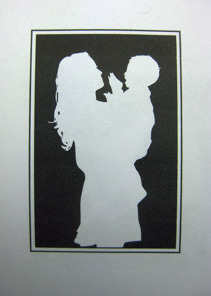
This is the parting shot, a 'cameo' of a mother and a very happy little boy.  This will be used for a Mother's Day card - and for other appropriate events.

Well, folks, that's about it for this installment.  I placed this article here on the Paper Wren Blog because, while it is sort of an education and information piece (which I would normally place on G. Johanson, Printer's blog) - it also describes one of our products, which I think makes it appropriate to place it here.  Hope you enjoyed the narrative and photos, and gained a little behind-the-scenes insight in this part of the Letterpress Production Process.

Good Providence in all your endeavors!

-gary

Tuesday, July 2, 2013

A Type Set "Job" order, continued. . .

Here is the final result: printed on a wove 67 lb stock, cut 3.25 x 5 inches, for inclusion with a letter, which will be folded into an envelope.  Count is 200.  Colour: Navy.  A few letters, or in the lingua franca of the print shop, "sorts"  in this cursive font had to be pulled and "pigged", or set aside for re-melting.  In my case, a box of dead type substitutes.  This is a very old and somewhat fragile font which I purchased from the original owner's widow back in 1991.  Mrs. Calvin said that the cases I purchased from the estate were already fifty years old when her husband obtained them, in turn, from a printery up in New England, if I recall correctly. That would make them over one hundred years old! 

The case is double laid, 12 and 18 points.  I have been weeding out "dead" type,  type that is damaged in one way or another, from this particular font for the past five years.  Many of the faces are simply worn down.  But there are enough sorts in good condition to maintain the font.  I cannot find a foundry that casts this exact font, unfortunately.  There are, however, boutique foundries that are making a point of locating and resurrecting original matrices as they find them, in order to re-cast many of those great ATF type faces of the past.  Skyline Foundry is one.  I purchase my new metal fonts from either M&H, San Fransisco, or from Bill Reiss at Quaker City Type Foundry, Honeybrook PA.  Both foundries also supply Colonial Williamsburg.

In fact, my "house font" is the same Caslon 337 Old Style (1732) as Colonial Williamsburg's, and as was the Smithsonian's Hall of Printing, back when they had a Hall of Printing.


This is how a "job" order arrives, with a lay-out.  Sometimes, the choice of letter styles are left up to me, as in this case.  I get the ok from a proof, whether a photographic image or actual impression, from the client, and off we go!


Here's a close-up.  The nice thing about printing from a "forme" of set type, is that very little ink is used, and more often or not, to get a nice and even layer of ink only takes one pass of the rollers.  But then, the "Platen Job Press" was designed for this very thing: publication.  They are the best book and publication presses around!

Ok, so I'm going back out to the shop to finish the run.  I might add that the Navy Blue was mixed by eye: process blue with about 10% "regular" black.  Oil based, of course.

-gary, Printer
Paper Wren Press.