slideshow

Thursday, August 1, 2013

Clayboard Illustration Technique.

Letterpress Artwork is not unlike artwork for silk screen seriography.  It's all either black or white imaging.  We call this "high contrast imaging". What I have started doing is using a media that is an old friend of mine, only now I am employing it another way.

Remember the venerable "Scratch Board" from High School Art Class?  The very best was - and still is - india ink over a layer of chalky clay, laid as a layer over a firm base, such as tempered masonite.  Nowadays they call it "Clayboard".

You can also find Clayboard in the form of white gessoed masonite, prepared for painters.  Also, manufactures of black Clayboard are offering their product without the black india ink surface. And here is where my interest was peaqued.

So, about two years ago I purchased some of both coated and uncoated clayboard and endeavored to develop some sort of illustration technique to help me reach my goal of an absolute black and white art image that is easy to edit.  So far, ink on white clayboard has been quite successul.  Here is my latest example:


I drew this image first on bond paper, and using some carbon paper, transferred the image directly to the white clayboard (if you look close you can see the "blue" carbon lines still.)   This is not unlike transfering an image onto linoleum for carving.  I then used markers and india ink to fill in the 'silhouette'.  The result is what you see above.


This is simply a close-up of the edge of the board, showing the tempered masonite backing.  These boards are thin enough to be scanned safely on a flat-bed scanner for vector conversion.


Thought I might sneak this in.  It's part of a project that I am working on, a series of Lombardic Filligree Caps.  This will take a long time to do on clayboard, it's almost like hand engraving because you apply the ink, then you go back in with a blade or graver or needle to clean edges, add stippling or hatching or whatever technique you are employing.  The difference is that when using a white board, it is less a matter of 'white on black' negative space thinking and visualizing, and more like executing a pen-and-ink piece.  You might say you get in on some of the benefits of both worlds.


My image is then scanned, edited on the computer,  then reversed.  This particular illustration will be used for my future "Congratulations - you're on the Nest" card.  This is the computer rendering, included the 18pt Open Caslon, of which I have as metal type.


A closer look.  The paper stock will be Crane's Lettera, 300gsm, and the blue image will be debossed on the Kluge, causing the white to raise up, not unlike an embossed piece. In fact, this was how the old Postal Stationery Envelope Stamps were printed, using a pliable platen to force the paper into the print die.  In my case, the die will be copper.


Close-up of the lettering.  I love using Open Caslong for titling!  And it helps to have a case of this type in 18 point upper and lower case with figs and numbers.  I need to get another case in 24pt.  As it is, this font that I have is over 100 years old, produced by ATF.
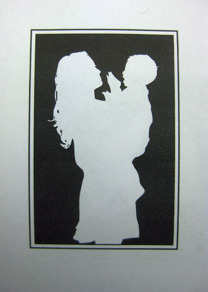


This is the parting shot, a 'cameo' of a mother and a very happy little boy.  This will be used for a Mother's Day card - and for other appropriate events.

Well, folks, that's about it for this installment.  I placed this article here on the Paper Wren Blog because, while it is sort of an education and information piece (which I would normally place on G. Johanson, Printer's blog) - it also describes one of our products, which I think makes it appropriate to place it here.  Hope you enjoyed the narrative and photos, and gained a little behind-the-scenes insight in this part of the Letterpress Production Process.

Good Providence in all your endeavors!

-gary

Tuesday, July 2, 2013

A Type Set "Job" order, continued. . .

Here is the final result: printed on a wove 67 lb stock, cut 3.25 x 5 inches, for inclusion with a letter, which will be folded into an envelope.  Count is 200.  Colour: Navy.  A few letters, or in the lingua franca of the print shop, "sorts"  in this cursive font had to be pulled and "pigged", or set aside for re-melting.  In my case, a box of dead type substitutes.  This is a very old and somewhat fragile font which I purchased from the original owner's widow back in 1991.  Mrs. Calvin said that the cases I purchased from the estate were already fifty years old when her husband obtained them, in turn, from a printery up in New England, if I recall correctly. That would make them over one hundred years old! 

The case is double laid, 12 and 18 points.  I have been weeding out "dead" type,  type that is damaged in one way or another, from this particular font for the past five years.  Many of the faces are simply worn down.  But there are enough sorts in good condition to maintain the font.  I cannot find a foundry that casts this exact font, unfortunately.  There are, however, boutique foundries that are making a point of locating and resurrecting original matrices as they find them, in order to re-cast many of those great ATF type faces of the past.  Skyline Foundry is one.  I purchase my new metal fonts from either M&H, San Fransisco, or from Bill Reiss at Quaker City Type Foundry, Honeybrook PA.  Both foundries also supply Colonial Williamsburg.

In fact, my "house font" is the same Caslon 337 Old Style (1732) as Colonial Williamsburg's, and as was the Smithsonian's Hall of Printing, back when they had a Hall of Printing.


This is how a "job" order arrives, with a lay-out.  Sometimes, the choice of letter styles are left up to me, as in this case.  I get the ok from a proof, whether a photographic image or actual impression, from the client, and off we go!


Here's a close-up.  The nice thing about printing from a "forme" of set type, is that very little ink is used, and more often or not, to get a nice and even layer of ink only takes one pass of the rollers.  But then, the "Platen Job Press" was designed for this very thing: publication.  They are the best book and publication presses around!

Ok, so I'm going back out to the shop to finish the run.  I might add that the Navy Blue was mixed by eye: process blue with about 10% "regular" black.  Oil based, of course.

-gary, Printer
Paper Wren Press.


Sunday, June 30, 2013

Typesetting is Alive and Well at Paper Wren Press!

There was a time not too awfully long ago when what was known as "job printing" - short order printing that usually fell in the category of printed forms, small menus, news letters, bill heads, business cards, all those sorts of printing orders that moved the business community on its merry way.  Job printing also took in the printing of announcements, greeting cards, sometimes Post Cards, and in the case of the shop where I operated the Letterpress alongside the big 36" ATFs and other offset presses, Karate Certificates for Y.K. Kim, Judo and Karate Master Extraordinaire.  Every member of our shop managed to get their own Black Belt Karate certificate!

As late as 1974, we kept a couple Hamilton cabbies of what is known as "California Job Cases", type drawers, filled with a selection of fonts in different point sizes.  At that time, the standard job font (or what is sometimes called the "House Font") was Century School Book and Bodoni.  For those occasional Wedding announcements that were on some occasions turned over to me, we had what was called "Wedding Text", a sort of Black-letter text that is sometimes called Old English.  We also had a beat-up case of Cursive.  I think it was Edwardian.  We also had the ubiquitous "Brush" and "Park Avenue" in 36 and 48 point type.

For those orders that required fonts or character counts that went beyond our "job font" counts, or the number of Upper Case and Lower Case characters we had per font, we had the local Type Setters down by the Train Station, on Sligh Street, known as "Orlando Graphics".  Orlando Graphics had a few bays of Linotype Machines that could produce lines of characters on a single slug.  We would place the necessary order, and on the way in to work the next day, I would pick it up, run it at work, and drop it off so they could melt it back down in the "pig", to re-cast again.  

This was the way "job printing" was done in America for over one hundred years, since the first line casters came into Orlando in the 1880s,  and in the case of hand setting "foundry type" from a type case, the prior 170 years, since the first Washington Press was trucked down to Orange City to print their first News Paper in 1840, a scant five years before Statehood. (date is approximate.  This Washington Press is still in the family, E.O. Painter, of DeLeon Springs, Florida.  I've handled it.)

In the tradition of the old Central Florida job printers, and in the tradition of my first area of professional training, I take in the occasional "job" order.  After all, our beloved Iron Horses are known traditionally as "Platen Job Presses".  Indeed, almost all of the Flywheel type platen presses made since the Ruggles Card Press of 1820 were dedicated Job Presses!  My C&P and Kluge presses are especially suited for this sort of work.  Despite the current trend in Letterpress to use Polymer Plates, Paper Wren Press still uses wood mounted copper dies, and we keep about twenty cases of Foundry Type on hand, specifically for hand-set job-orders.


Today's order is a Banquet Announcement for the Central Florida Pregnancy Center, our local crisis pregnancy center.  The order came in the traditional way, whether or not they were aware of it.  The text was written out on paper, arranged in the manner in which they wished the letters to be arranged, with a sort of indication which lines were to be pronounced.  They left it to me exactly which fonts and sizes to use.  The size of the card is 3.5 x 5 inches, single sided.  It will be printed on 100lb Neenah card stock, smooth, off-white.  A sort of Ivory colour.  They will be supplying the paper.


This is the orientation which the compositor, or "type setter" views type as it is being set in the composition stick.  Type is "pegged" into the "stick" from left to right, upside down, "nicks-up".  Each line has a properly cut 1pt. lead in between, separating lines of type.  This gives rise to the term "leading out" a line, still used by digital typesetters today.  

The first line is 18pt "Open" Caslon, from a foundry font cast by the American Type Founders about a century ago.  The next line is an Edwardian cursive,  18 pt cast on a 24pt body.  The next line repeats the use of the Open Face Caslon.  The next line is set in 12pt. Caslon Old Style, cast by Quaker City Type Foundry in Honeybrook P.A., the same foundry Colonial Williamsburg uses for their colonial print shop. The next line is 12pt Caslon Italic.  The rest of the lines interleave 12pt "book" Caslon 337 with the 18pt Caslon open face 18pt.


As an Artisan Printer, the use of hand-set type is not only a practical resource, but it is also an art unto itself.  Handset metal type dates all the way back to Gutenberg, in the 1450s.  It is a tradition that remained virtually unchanged for over 500 years.  I am amazed at the reluctance of today's boutique Letterpress Establishments to go beyond their Polymer dies and Boxcar bases.  Yes, metal type isn't cheap, and yes, it makes for a heavier chase....that's what "heavy-metal" printing is all about, gang!  The most pure form of printing "by hand".  

And . . . the most beautiful.  Nothing beats Handset.  Nothing.

Paper Wren Press is among the very few Letterpress operations in Florida offering this service (as far as I am aware).  University of Tampa / Tampa Bay Book Arts Studios still do handset and line-casting.  Beyond TBAS and ourselves, I am unaware of any other in the State.

That's it from Paper Wren Press.  Please feel free to contact us from our site at www.paperwrenpress.com , or email us with any questions or inquires regard Typesetting by hand, or any other service we provide.  Our email address is gary@paperwrenpress.com  

Look over this blog, and also the "Printer's Blog" for more facets of Letterpress Printing.

-gary, owner.


Tuesday, June 4, 2013

The Indie Market Show: A Great Time Had by All!


 The Indie Market Artisan Craft Show took place on Artisan Alley, Deland Florida, this past Sunday, June 2. I have to thank Courtney, of Newfangled Market, for both sponsoring this show, and for the last minute adjustment she worked out which allowed us to set up our 'booth' under the shelter of the parking garage.  Rain was in the forecast, not a good thing for paper goods!  Despite the rain, we had a great turn-out! 


 The primary goal of Paper Wren Press, aside from selling our products, was to introduce ourselves to the local community.  Our table featured A2 stationery cards designed by Anna Coleman, who attended the show  with us, showing her original art as well as her prints.  We also featured our French Empire Post Cards, and our portfolio, showing our custom work over the past few years.  We also had a guest book ready for visitors.


 We had some of our coasters available, too.  In the photo above, you can see a little of the cross section of product offerings we featured during the show.  We also had a video of the Letterpress in operation, all of which can be found on my YouTube channel "wd4nka".  One of the video demonstrators, Alton Shady, came to visit with us along with his sweet wife Rebekah, from the Tampa / New Port Richey area, along with Carl Nudi and Joshua, from the Tampa Book Arts Studio, University of Tampa (TBAS), and Jan, from West Palm.  (Sorry, Josh, I forgot your last name!  Blame it on the hospital visit  - or maybe I'm just getting old... :)


 The photos above and below show the artwork of Anna Coleman, which follow an animorphistic theme: Dogs, along with common woodland creatures, each wearing something which brings out a human character to their own nature.  My favourite is the hedgehog, which I think I can persuade Anna to sketch out for the next run of greeting cards.


Part of my job as Printer and co-owner, is not only to introduce Paper Wren Press, Artisan Letterpress - to the community, but also to educate the community as to what Letterpress is all about.  Central Florida is a rather "Johnny Come Lately" to the Letterpress scene, most folks really don't know what Letterpress is all about.  In fact, we had one person refuse to believe our greeting cards were really Letterpress printed at all, because they do not have a deep deboss.  We showed how Letterpress is not defined by deep impression alone, but rather, by crispness of fine detail and excellent design.  Deboss is only one characteristic of raised surface printing.  Whether or not he believed us is another story . . . .(sigh).

All in all, we sold over twenty units, Anna sold a lot of her paintings, and received commisions to do custom animorphistic "portraits" of pets of some who visited our table.  The greeting cards seemed to be popular, selling a lot of eight-packs and singles, and as well, we had a lot of folks asking questions about custom Wedding stationery.  We'll see what the up-coming months will bring.  Oh, and also, we have one QSL card commission!  Thanks, Nick!

I will be adding more photos of our cards on an upcoming post.  Meanwhile, I have posted, at this point, our French Correspondence Cards on our "G.Johanson Letterpress" Etsy shop site.  I will be adding our other show offereings as well.

That's all for now.  Stay tuned!

-gary


Wednesday, May 15, 2013

New Greeting Cards by Anna Coleman, Illustrator!


My prior post featured an announcement for the Indie Market artisan craft / arts show in DeLand, Florida on Sunday, June 2nd.  This will be our first ever show, and we thought we would start off with a whole new series of cards especially created by our illustrator, Anna Coleman.  Anna already has four children's books to her credit, and has since developed her technique in pen and ink, specializing in the Animal Kingdom.  Our latest series of limited edition art cards feature four cards, printed on French Paper's Butcher 80lb cover stock, with matching envelopes.  Each A2 sized card features one of four birds, a Bob White, a Wren, two Spice Finches, and a Robin.

Anna has a particular knack of attributing a human persona to animals in the wild.  This was a very interesting format that she began to experiment with during her years at Flagler College, which grew into a type of animal rendering which she calls "Animorphism".  These are not cartoon-like caricatures!  Each bird is faithfully and realistically rendered in a style which reminds me a little of Thomas Nast, of Harpers' Weekly.   The artist determines a characteristic that each animal possesses, which might, in turn, characterize a personality. Then, a tell-tale article is added to the bird.  A bowler hat, a vest, perhaps a newspaper tucked under a wing. Or, even a turban!  It's amazing how human traits can be seen in the animals of creation all about us.

Each print is a faithful reproduction of Anna's original pen and ink rendering, produced into hardwood mounted metal dies, which are hand printed on one of our iron Letterpresses. The process takes the better part of one day to set up and print, the folding process, another hand wrought operation, takes most of the next day.

Since these are limited edition cards, they will be packaged by sets of four cards/ envelopes per package.  These will be sold from our table at the Indie Market Show.

And now, a sneak-peek:

These are the cards, right off the press.  I did not mention the card in the lower left, which we will be selling individually.  This is one of Anna's "Robot Cards" which we published at G. Johanson, Letterpress a couple years ago.  We thought we would publish a run of these cards, too.

Here is an unfolded shot of "Runaway Robin".  There is a close up of each of the Bird Cards as we proceed.

These are the hardwood mounted dies produced by Owosso Graphics, of Owosso, Michigan. These particular dies are cast in magnesium, mounted type-high for Letterpress use.

We call this one "Turban Bird".  Yup, he's a Bobwhite.  The feather tuff on the Bobwhite's head is what sent Anna's imagination to the middle east.  His vest has Turkish brocade buttons and collar.  Styling!

These two Spice Finches are none other than "Orville and Wilbur".  These are in reality Anna's own finches which kept her company all through college, and still reside happily with her and her husband in their home.  At one point, Anna came across a 1903-vintage photo of Orville and Wilbur Wright, both sporting dapper bowlers and vests....and she couldn't resist.


Close-ups of Wilbur and Orville, to show the individual pen strokes required to render these illustrations.  There is very nearly a wood-engraving feel about them, which is what reminds me of the newspaper and magazine illustrations of the 1860s and 70s.

Wilbur is a little more formal: he is wearing his cravat. I guess if they were 'first in flight', might as well be 'first in fashion' as well!

This little guy is my favourite.  He's a little Wren that we call "Newsie".  He just . . . reminded us of the movie namesake.  All that quick, energetic persona just needed a 19th century vest, workers cap and, of course, a paper under wing. 

I took this photo as I was setting the scoring rule on the press.  I always get a little impatient to see the finished product.  This little guy is "Runaway Robin".  Having lived at both ends of the migratory path of the Robin, I can see how Anna spotted the rather transitory, hobo-like nature of one of my favourite birds.

This is Paper Wren Press' new logo.

That's all for now!  Friday we will have a "stuffing party", where we will be assembling the sets and packaging them for the show.  We should have over ninety packaged sets available for the show.  Hope to see you there!

-gary.

Thursday, May 9, 2013

Deland Indie Market Show at Artisan Alley!


Paper Wren Press will have a display table at the Deland Indie Market event on June 2, 12:00 - 7:00.  The show will be held in Deland's Artisan Alley, a restored turn of the century masonry warehouse area which has become the Arts center of Deland.   For more information, contact Courtney, of Newfangled Modern Market.


Hope to see ya there!


A Very Special Wedding Project.


I've heard it said that one of the chief advantages of Letterpress Printing is that you can print virtually on anything.  This week we put this to the test with Chris and Rebekah's Wedding Announcements.  One of the unique characteristics of my clientele is their creativity and willingness to be part of the process of making their cards.  I believe Chris hit the high water mark in this regard, in that he chose . . . to make his own paper!  The story of how he, along with Josh Ruston, created this paper will follow in a subsequent installment.  But for now, some images of this amazing project.


The paper itself was made in a home made 'beater', consisting of an old Jack Daniels Whiskey barrel, charred on the inside for waterproofing, lined with stationary blades with provide narrow clearance for the sickle-like rotary blades that rotate between them.  This action "beats" the vegetable pulp, forcing them to hydrate without cutting or slicing the fibers.  Included in the pulp mix was burlap, grass clippings, small fragments of charred wood from the barrel itself, and recycled book pages, which created a low contrast kaleidoscope of colour.


After the paper was couched from the deckle, it was set out to dry in the open air, then, when fully coalesced, yet damp, it is pressed.  The result is a deckled-edged irregular sheet that resembles something on the paper side of papyrus.  It is somewhat irregular in thickness and dimension, posing quite a challenge in feeding to the press.


Letterpresses - indeed, ANY printing press - wants to see very flat, uniform stock.  In order to feed something like this to a press, one has to use both hands.  On hand pushes the stock flat, the other guides it into the gauge pins as best as it can fit.  Needless to say, precise registry is out of the question!


Once the card is in place, the platen closes, and by golly!  It receives a really nice impression!  One of the things we tried to do to insure as even a margin as possible, considering the irregular edges, was permit wider margins around the card which makes the occasional tilting of the image much less noticeable.  The imperfect surface did create slight variations of impression depth upon each of the cards, further lending to it's rustic look.


The use of a large rubber band across the "frisket fingers", or "gripper bars" helped to pull the stock away from the die, just in case.  There was little trouble with this, however.  The paper was amazingly well behaved.


The envelope used is French Paper Company's "Packing Brown Wrap", which is essentially the same type of paper that brown grocery bags are made from.  In fact, brown grocery bags can make a very interesting stock for envelope conversion and printing. (So do recycled cereal boxes, for business cards.  Just a hint, there.)  Letterpress and recycling go hand in hand.  It's the must sustainable industry on earth!


Here is a shot of the completed card. I might add that Chris designed the text along with me.  We were both at my ancient FreeHand MX 2004 IDE, dragging the mouse and punching the keyboard.


One final shot: remember my describing the contents of the pulp?  I had to get a photo of this piece of a capital letter "B" from some recycled page bit.  You never know where these pieces show up on the stock, it can create quite an interesting effect.   The recycled paper is added late in the mix, which keeps it from entirely breaking up in the beating process.  You can also see the burlap fibers woven through the stock.

Well, the order is done, and the stack of cards awaiting delivery look almost medieval. They just clear their A7 brown envelopes.

Well, that's it for this installment.  One thing that I have learnt from this project, which is the adage is true.  You can print on practically anything with a Letterpress!  But you have to sometimes do it very slowly, and using both hands.  But then, that's what Artisan Printing is all about!

Click here to catch the installment on the making of the paper, on the G. Johanson, Letterpress Printer blog site, which is our information and educational blog.

-gary, at the Paper Wren Press.